Monday, 18 March 2013

Project - Tone and Form

Exercise - Observing shadow and light formations on a surface

When objects are pale coloured and on a pale surface, it is relatively easy to distinguish both shadow and direct and reflected light on surfaces. It becomes more difficult when the objects are different colours or textures. This exercise did show how much effect reflected light from a surface has to the underside of an object.

Tonal studies showing primary light source, shadows and reflected light

Exercise - Tonal Studies


I found with this exercise that it's difficult to match tonal grades between different mediums. For example the lightest marks made with a dip pen are still much darker than the equivalent marks made with an HB pencil.

I was pleased with how the tones defined the forms of these objects and how the lighter areas lift the object from the background.

Research Point - Odilon Redon

Odilon Redon was born in Bordeaux, France and showed artistic ability whilst still at school, having lessons in drawing and watercolour.  At the age of 15 he began to formally study drawing but his father insisted on him studying architecture however he failed to qualify for entry to the Paris’ École des Beaux-Arts, putting an end to those career plans. He took part in the Franco-Prussian War in 1870 and moved to Paris after that. It could be said that his experiences at that time combined with the death of his father and son in 1886, contributed to his works of this period which he called his 'Noirs'. These works in dark charcoal have a nightmarish quality that may have reflected his state of mind. Below are links to two of these works that appear to be typical of this period:

Guardian spirit of the waters
The crying spider

Redons work was not widely known until in 1884 a J K Huysman’s novel “A Rebours” (“Against Nature”) was published in which one of the characters collected drawings by Redon. This wider recognition also cemented his association with Symbolism, a literary movement focusing on the imagination as its creative inspiration. The Symbolist painters rejected the Realism and Impressionism art of the time as being too limiting, whilst using stylised images that created dream like scenes.

Odilon kept a journal which might give some insight into his work. He explains that painting the smallest details of an object before him left him totally dissatisfied.  However approaching the subject from his imagination and then he would feel the assurance and release. Redon's work seems to be an exploration of the workings of his mind at any given period in his life. 

Check and Log

I found it quite easy to distinguish between primary and reflected light when observing and drawing objects. Depicting the ranges of tone became more difficult when objects vary on colour or texture. The way that light and shade fall on a subject is crucial to understanding and describing the form of an object. It tells the observer a lot about how the surface curves or how two surfaces meet. It also helps to describe the surface texture, whether it's smooth or rough, shiny or dull.

Project - Using Texture

Exercise - Experimenting with texture

I find it quite difficult to experiment with different mediums in an attempt to describe different textures. I feel that I'm not entirely happy with the results and find I think too much about how I might apply this new texture to a drawing rather than just seeing what might happen. Looking at my sketch book page now, I can see that I'm much more comfortable with finer drawing tools like fineliner pens rather than charcoal.
 
Experimenting with textures
 
Examples of Frottage

Project - Still Life

Exercise - Still life sketches of made objects

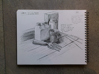
It was a sunny day so I decided to go outside for this exercise.  I found plenty of interesting objects in the polytunnel, so decided to set up my composition on the potting bench.  Using a fineliner pen I sketched the same collection of items from slightly different viewpoints using crosshatching to define the forms. I also tried to establish why some compositions work better than others.  My prefered composition can be seen in the top right corner of the sketchbook page below. I chose a slightly lower viewpoint which gave a more dramatic look to the objects, the top of the tallest items being level or above my eyeline. Almost like buildings!  Another important element if found to the composition is how the edges of objects ovelap to break up the outlines and introduce an interesting interplay of shadows and reflections. 

Prefered composition top right

The addition of a small part of bench in this composition helps to anchor the objects in space

Exercise - Composition of natural objects

For this exercise I chose to use some large seashells that have interesting surface patterns and textures. By using a spotlight I was able to create some strong shadows which by using appropriate tones in my drawings, helped to describe the forms and textures on the shells.  I found it quite difficult when arranging the objects to create a composition that I was entirely happy with. For instance, how to create a composition that leads the eye around the drawing?  I liked the way that an offset composition of objects had a more natural feel than centrally placed objects. Space to the right in the sketchbook page below, seemed to draw the eye back to the objects. Or is that just me?

Still life with an offset composition

I also explored two other arrangements as seen in the page below.  The rule of thirds considers placing important elements at the junctions of intersecting lines placed at 1/3 of the page.  I also tried using the objects to create lines for the eye to follow.


Check and Log

I think its much easier to describe 3 dimensions when drawing man-made objects. I think this is because these objects are often regular in shape and have a symmetrical appearance.   Our everyday experience with these objects means that we have an expectation of how they appear. If a drawing is not portraying an object as we expect, our senses immediately tell us something is wrong. When drawing, I find this helps me to decide if lines or tone have been applied correctly.  The often irregular appearance of natural objects means that accurately describing them in a drawing requires much more careful observation.
I created the feeling of solidity in objects by making sure that the shadows reflections and light describe accurately how the objects interact with their environment and other objects around them. For instance the shadow below an object tells you a lot about how it rests on a surface.
Changing the arrangement of the composition made me focus on why some arrangements appear to work better than others. Experimenting with different arrangements highlighted how the interaction of the objects, light and shadows allowed me to show the form of the objects.
In the same way that rearranging the objects created better compositions, how I positioned myself relative to the objects had an even greater effect as it was possible to dramatically effect the whole composition by simply moving my own position.

Exercises - Observing negative space and perspective

I couldn't help thinking that this exercise might have been more useful at the beginning of the course. I have found it really helpful when drawing objects to look carefully at the spaces between them in order to check that their relative positions are correct.


Project - Reflected Light

Exercise - Study of light reflected from one object to another

I was a little confused about what I was supposed to be looking for in the reflected light and shadows on this exercise and I don't think the example given in the course notes was very helpful. My drawing shows some areas where the light reflecting from the shiny metallic surface of the pan, lightens the surface directly around it and the shadows that are being cast.

Study of reflected light from one object to another

Exercise - Shadows and reflected light and shade

 This was another interesting exercise which highlighted for me the difficulty in determining reflected light areas from reflections of the other objects and surroundings. This I found particularly difficult when the subjects were dark coloured as mine where.


I did enjoy this exercise working at a larger scale with charcoal and putty rubber.


Research Point - Patric Caulfield

Patric Caulfield studied at Chelsea School of Art from 1956 to 1960, and the Royal College of Art from 1960 to 1963.  Following the New Generation show at London's Whitechapel Gallery, he became associated with Pop art, a label he always denied, seeing himself more as a 'formal artist'.

Caulfield’s work: positive and negative shapes

Much of Caulfields work depicts everyday objects and scenes. They often have very limited tonal ranges as can be seen in his White Ware screen prints.  In these works, he concentrates on the use of negative space to  outline the subject, that combined with the selective use of solid areas of colour give the impression of a collage of cutout paper shapes.  On looking at these works, I find myself wondering what the scene really looked like in front of him as he was painting. Some of the shapes suggest obvious light sources such as a shaft of light from an open door or window in Arita Flask - Black, but in others, for instance Large White Jug, the light source seems to come from behind the jug, but the jug also appears to be illuminated from the front.


Check and Log

Separating cast shadow from reflected light and shade can be very difficult particularly in objects that are highly reflective such as smooth stainless steel. I found that the reflections of surrounding objects  played a much greater part, obscuring any reflected light. To make the reflections look convincing I found it necessary to observe their shapes very carefully and try to understand why the reflection has been distorted in the way that it has.  Its like looking at the concave and convex surfaces of a spoon - why is one reflection turned upside down?

Wednesday, 6 March 2013

Project - Basic Shapes and Fundamental Form

Exercise - Boxes and Books


This was an enjoyable exercise in describing the basic shapes of regular shaped objects.  My first sketch was done a bit too quickly and on completion I realised that I needed to take more time to observe the relative sizes of the objects.

First sketches - need to observe relative sizes and positions more carefully

This time I paid more attention to the sizes

Exercise - Jars and Jugs

Cylindrical objects have the additional complication of describing flattened circles - ellipses.  I decided to work on drawing these first with a practice page in my sketch book.  The difficulty for me was creating a symmetrical shape, as I found being right handed, drawing a curve in one direction is much easier than in the other.

Practice ellipses

 In my first drawing, I found it difficult to match the sizes of objects like the salt and pepper shakers which are the same size.  The second attempt was more successful and in both drawings I was happy that there was a feeling of depth and perspective.

First drawing. Need to watch the relative sizes still.
Second drawing - better relative sizes but still need to watch the symmetry of curves
Third drawing with dip pen and ink, quite pleased with how this turned out.


Exercise - Supermarket Shop

The relative sizes of the objects are quite good, the ellipses of the tin are a bit flat.

Check and Log

I was generally happy with achieving a feeling of depth in my drawings and happy that the objects looked solid. I was aware of the need to observe the relative sizes and positions of objects and a useful way to check this is by looking at the negative spaces between objects and not just the positive shapes of the objects themselves.

Tuesday, 26 February 2013

Project - Making Marks

I found the initial exercises more difficult than I anticipated.  As a technical and scientific illustrator, I'm very familiar with working in fine detail and so was comfortable with making marks with drawing pens and pencils but much less comfortable with the messy stuff like charcoal.

It's the control-ability of the pens and pencils that I like. I find it much easier to build up tone using fine hatching than with charcoal. However this means that I have a tendency to work at a small scale. Working with charcoal forces me to work at a larger scale which was quite intimidating at first but I think doing more of it will be a useful learning experience.

Coloured Pencil Marks
Marks made with pen and ink, fine-liner pens and calligraphy pens


Exercise - Using Charcoal
 I think charcoal is great for working quickly and at a large scale. The range of tones and line thickness that can be produced from a single stick make it very flexible for sketching quickly and made me consider the tonal ranges in my subject.

Exercise - Line and other marks
 

RESEARCH POINT

I was aware of van Goghs skill with pen and ink drawings but closer inspection of some of his works made me appreciate the range of marks he made and how their use conveys different texture, tone and even distance within the image.  The drawing below seemed to be a perfect example.

Harvest Landscape - van Gogh

CHECK AND LOG

The way that I hold the pen or pencil has a big effect on the way I draw.  Fine pens and pencils held close to the tip encourage tighter more controlled marks to be made where as a larger piece of charcoal is good for larger more fluid strokes.
I can see that the softness of charcoal marks could be used to convey calm in a drawing and the finer 'scratchy' marks made by pen and ink could easily translate to an uncomfortable frenzy.
The addition of colour added another dimension to think about. It didn't really affect the marks that I made, but it did make me think about how different colours affect the tonal values.
I found the exercise with making lines and other marks in the squares to be the most interesting. I found myself thinking about different textures around me and what might be the most suitable medium for conveying those textures in a drawing.